Apploi
What’s the issue?
Apploi is building out a new staffing tool they just acquired (OnCall). Their goal is to help care facilities optimize their bottom line. But most users don’t understand the tool without hand holding and extensive onboarding.
What was my impact?
8 new facilities added with existing clients, Onboarding reduced to 1 day from 1 week, users had near perfect task completion.
Team
Product Designer
Product Manager
Founder
Contract Engineers
Timeline
Month 1: Design
Month 2: Develop
Month 3: Beta test
Not another onboarding training...
Why do we need training?
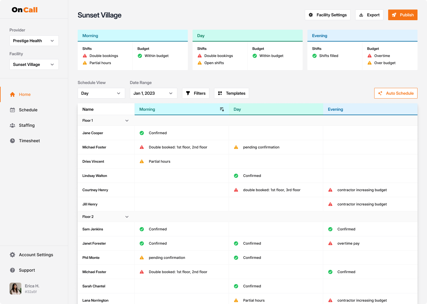
The current designs lack any information architecture, leading to confusing flows and one off components. Users end up guessing where things live in the UI.
What’s the negative impact?
Most users require 1 week of training before they are able to schedule without supervision.
What could be causing this?
Lack of ux thinking in the page layout
No components leads to inconsistency
Without ux foundations users have to guess
Creating alignment between the users, business, and product
Important to users
Able to jump into the job within a shorter timeframe
Time spent onboarding
Important to the business
More clients using the tool, as well as more facilities per client
# of clients & facilities signed up
Important for the product
Able to reliable and accurately complete their tasks
Delta for under/over staffing
How did we get set these metrics?
Users made it clear that there is a lot of friction in starting on the job, some even leaving for facilities with older tooling
As a newly acquired product, the goal is to get existing clients to adopt the tool
Our product value is closely tied to client business goals, hitting these goals is key to building a strong brand
A forever first time user
Why is there so much onboarding?
The role of a staffer has a very high turnover rate. This is usually a stepping stone for higher paying jobs within care facilities. Getting into the work asap is key for staffers to grow in their jobs.
How did we get here?
All initial interviews were done exclusively with management at the facilities, not the staffers themselves.
Why is this bad?
OnCall doesn’t understand staffer workflows
Reinventing the wheel over simple solutions
Prioritizing the wrong metrics for users

Identifying roadblocks
What sucks about the current designs
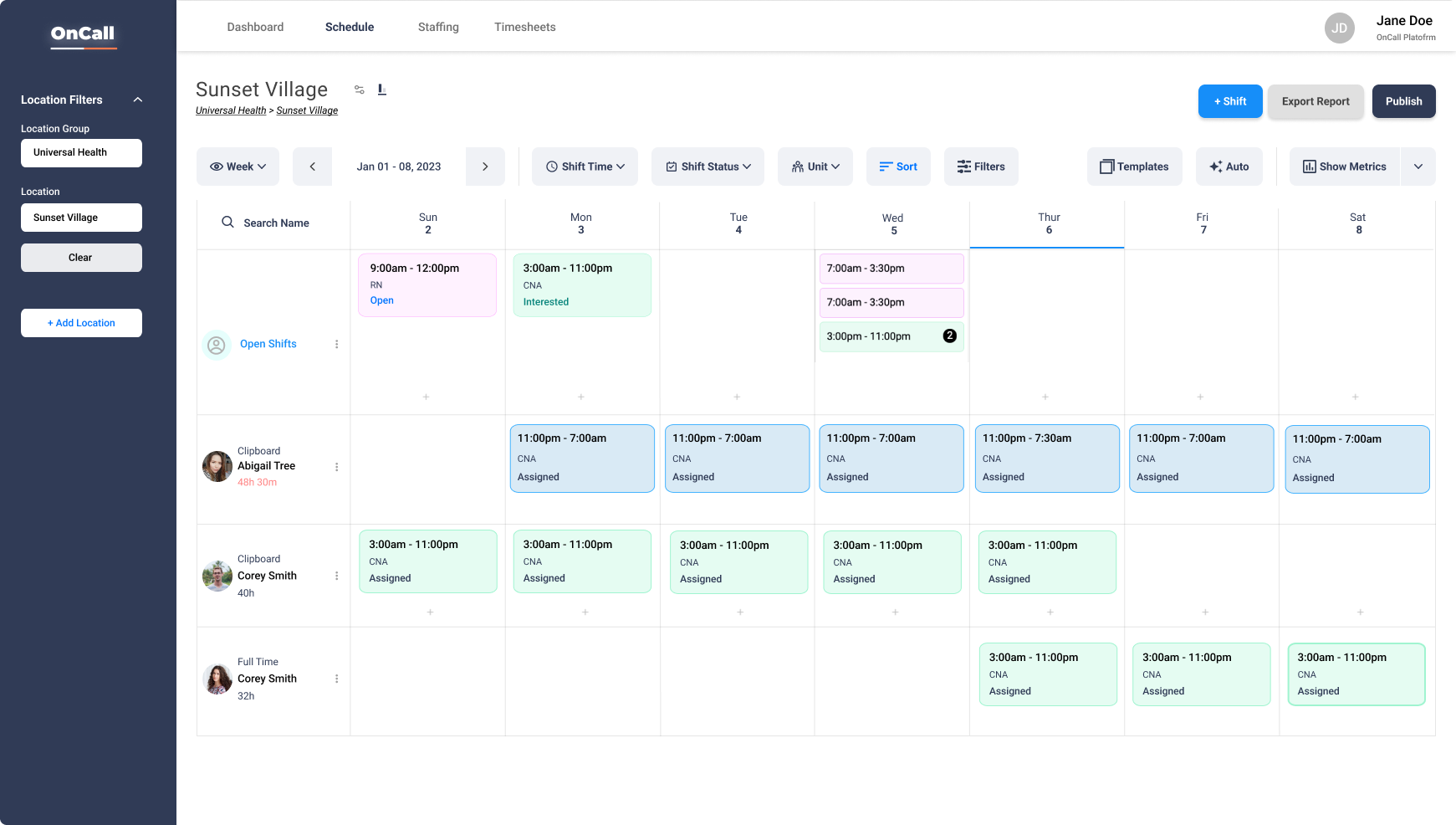
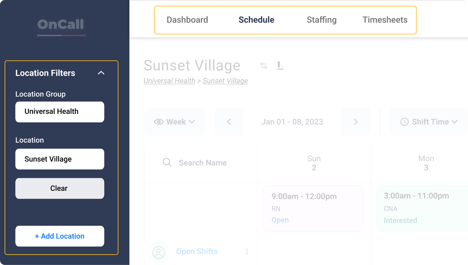
Navigation split across areas (top & side)
Uncommon interaction patterns
No correlation for similar actions
Why is this bad?
OnCall doesn’t understand staffer workflows
Reinventing the wheel over simple solutions
Prioritizing the wrong metrics for users


What can be changed?
Structure
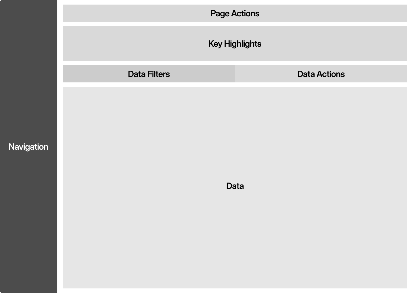
The page layout needs a pattern that users can quickly understand and stays consistent.
Correlations
Grouping actions together will make it easier to find actions that do similar things.
Color
Color has meaning, but not when its over used. A clear and minimal pallet will help users understand component states.
How else will this help?
Consistent patterns speed up development
Grouping actions creates patterns
Color can reinforce meaning alongside text


What does it look like all together?
Simple
The role of a staffer has a very high turnover rate
Inline
The role of a staffer has a very high turnover rate.
Familiar
All initial interviews were done exclusively with management at the facilities.
How else will this help?
Consistent patterns speed up development
Grouping actions creates patterns
Color can reinforce meaning alongside text

Implementation respective to development costs
Phase 1
Feature specific
Implement new components for the specific feature page being built first
Phase 2
Global UI
Apply the UI styling for things like buttons & modals to create a consistent feel
Phase 3
Global layout
Refactor the products navigation and global flows across features so users know where they are
How else will this help?
Consistent patterns speed up development
Grouping actions creates patterns
Color can reinforce meaning alongside text
Reduced onboarding and increased clients bottom line
Users impact
Cut down onboarding to 1 day
Working directly with staffers was key to simplifying things
Business impact
8 new facilities added
Clients saw the improvement towards facilitating their goals
Product impact
<1% over/under per staffer
Clear use of color and hierarchy reduced mistakes by a lot
How did we launch & validate?
We worked with 3 clients and 10+ users, new and existing, to validate our designs
We sent clients clear reporting showing how the new designs impacted bottom line
Creating a design system made it easier for developers to work in sync across different contracting agencies
Next Case Study: Umba


